#1 Social Media Marketplace
Accelerate Your Social Media Growth with SocialWick. Quickly gain real followers, viewers, likes & more with our blend of marketing tactics. SocialWick is known for its fast delivery, premium quality, and low prices. With over a million satisfied customers since 2017, trust SocialWick to take your social media game to the next level.
1.4 M
Customers
13 M
Orders
362 M
Followers sold
1.8 B
Likes sold
How to Choose the Right Social Media Fonts
Published on 20.05.2026 by Tracey Chizoba Fletcher
In a world where social media feeds are filled with content, you need to master social media branding in 2026 to capture your target audience's attention. One element of social media branding is the font. When you choose the right font for your brand, you can make your content stand out.
But how do you select a font that looks good and resonates with your target audience? The first step in doing that is by understanding how typography affects communication. In this article, we explore the role of typography in communication.
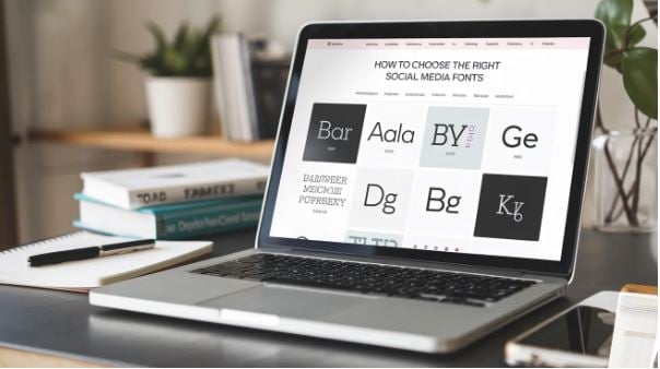
Importance of Typeface in Social Media Branding
The choice of a typeface will contribute to your overall brand identity as it is a silent but super-powerful communicator. Here are some reasons to have consistent fonts in your social media branding:
Showcasing Your Brand Values and Personality
Typography is more than a design choice; it reflects your brand values and personality. Different typefaces can evoke different emotions. For instance, serif fonts are a good reflection of reliability and tradition, while sans-serif fonts can indicate clarity and modernity. Your choice of a font will affect whether your brand is seen as personal, trustworthy, or professional.
Consistency Across Platforms
Using the same font consistently across social media platforms can help ensure better brand recognition. When your visual identity is coherent and built up in the same typeface across different social media platforms, consumers can see a consistent brand image. This provides them with confidence in your brand and familiarity.
Enhance Brand Recall
Consistent typography can help improve your brand recognition, as consumers can associate the font with the brand before they read the content. Consistency in typeface, whether in social media, print, or digital spaces, ensures a more unified brand image. When brands use a consistent font across different channels, they become easily recognizable by their target audience.
Better User Experience
Consistency in typeface can lead to a better user experience and improved SEO. A standardized typography can improve readability, increase accessibility, and reduce the bounce rate
Evoking Emotions
Fonts can evoke certain emotions, impacting how your social media audience perceives your brand. For instance, the Northwell brand uses a handwritten style that makes it feel approachable and personal, making it a better choice for brands aiming to create a friendly image. On the other hand, ChunkFive uses a bold, attention-grabbing font for its headlines. Understanding how fonts affect your brand can improve the effectiveness of your campaign.
Unified Brand Messaging
Typography involves more than just choosing some beautiful letters. It involves sending emotions and ensuring a secure connection. Remember that each interface has a personality. For instance, Montserrat is usually cleaner and more modern, while Playfair Display shows traditional elegance. This means you need to select a font that aligns with your brand voice, not just something that looks beautiful on the screen.
When someone encounters your graphic, does it evoke a sense of curiosity and trust? Does it show authority or playfulness? These are some of the nuances that matter in shaping your brand perception before social media users even read your posts.
Steps in Choosing Your Social Media Font
The right social media font will impact your audience's ability to capture attention, convey the brand personality, and ensure readability across devices. However, with so many typefaces available, it can be hard to choose the right one. Here are some key factors you need to consider when selecting one:
Brand Identity
Before you choose a font, you need to understand your brand identity. Fonts usually communicate your values. For instance, the Sabon serif font can show tradition and elegance. On the other hand, a sans-serif such as Lato provides a clean, modern look. Therefore, start by understanding what your brand stands for and ensure the font aligns with the values.
Prioritize Cross-Device Readability
Since social media users consume content across devices like desktops and smartphones, it's important to prioritize readability. Some fonts, such as Montserrat and Roboto, are designed for digital screens because they offer greater clarity at smaller sizes. Do not use the overly decorative fonts that may hinder readability, even when they look beautiful.
Minimize the Number of Fonts You Use
If you use serif fonts, your content may appear unprofessional and cluttered. This is why it would be a good idea to use two or three fonts: one for the heading, one for the subheading, and one for the body. Using such an approach will ensure a visual hierarchy and consistency.
Timeless Social Media Fonts to Consider
If you need an outstanding social media font, here are some options to consider:
Montserrat
If you need a social media font that provides a modern, clean look, consider Montserrat. It's available in different weights ranging from thin to thick. This makes it suitable for use in different design contexts. The font can work in the content headers and content, and the clean design makes it easy to digest.
Diudot
Diudot is an elegant and distinctive font popular for its dramatic contrast between thin and thick strokes, smaller serifs, and circular lines. Its high contract levels add a fashionable and chic look to the design. It has a delicate, minimal serif, giving it a more refined, timeless look that conveys elegance and luxury. Top brands such as Giorgio and Zara use this font.
Futura
The versatility of Futura has made it popular across a range of design materials, from corporate logos to posters. It is used by major brands such as Red Bull and Nike for its clean, contemporary look. The brand has a distinct aesthetic, coupled with long avenues that give it a Roman capital feel.
In Conclusion
The choice of the right font for your social media campaign can make the difference between success and failure. It involves tracking your brand identity, improving readability, and selecting fonts. When you thoughtfully select a font, you can enhance your brand presence and build a stronger connection with your audience. You can read our guide on podcast branding to build a memorable audio identity.

Sign up for SocialWick
Login
InstagramYouTubeTikTokFacebookTwitchSpotifyTwitter (X)SoundCloudIGTVLinkedInThreadsWebsitePinterestVKApple MusicSEO
Checkout
OK

Information
Order processing usually starts within a few minutes, but some services may take a few hours or even a few days. We offer free refills for up to 90 days if needed. Our services are 100% secure and discreet, with a focus on gradual and safe delivery for your peace of mind.
Order processing usually starts within a few minutes, but some services may take a few hours or even a few days. We offer free refills for up to 90 days if needed. Our services are 100% secure and discreet, with a focus on gradual and safe delivery for your peace of mind.
Where should we send your order confirmation?
No account needed! We send your confirmation and tracking link here.
Secure checkout. We never share your email.
Have an account?•
Log in
Use your account to pay faster with your saved details.
Create account
Create an account to track all your orders in one place.
Service
+0,00
Voucher
-0.00
Total
+0.00
OK
Affiliate & Reseller Program
Customer Support
How may we help you?
General Support
Order Support
Frequently Asked Questions
1) What services do you offer?
We are a social media marketing company, and we offer a wide variety of services across several platforms that our clients can choose from. Once selected, we create a plan that fits your needs. We offer several types of services, such as followers, subscribers, likes, views, song plays, etc.
2) Is your service safe?
Yes, as we only sell real followers, likes, views, etc., and we hold every service to strict authenticity and quality standards. In order to protect your account, we deliver every order carefully and gradually. We closely monitor all our services. For more information, we strongly recommend reading our Terms of Service before you order.
3) Will I need to give you the passwords for my accounts?
No, you can keep your passwords to yourself because our services don’t need a password to influence your accounts. And if an email ever shows up claiming to be from us and asking for a password, it’s definitely not us, so please let us know right away.
4) Are the likes, followers, and subscribers real, or are they bots?
Unlike many other services, all our likes, followers, and views come from real accounts operated by real people. You won’t find bots, fake profiles, or hijacked accounts anywhere in what we deliver. Every order has to pass our strict authenticity standards, and we keep checking our quality to make sure it stays that way.
5) How fast can you deliver my order?
We will show you the estimated delivery time when choosing the service. However, this is only a rough estimate. In most cases, the services are delivered much faster. In some cases, it may take longer. We always aim for a natural and safe delivery!
6) What are your best-selling social media marketing services?
Although we have many services across most social media companies, our services for Instagram, TikTok, and YouTube are our best-selling options.
7) How do I know my account will not be flagged or banned?
We take safety very seriously. We never ask for your password, all followers, likes, and views come from real accounts, and orders are usually delivered gradually and naturally. What we can promise is careful delivery and strict quality standards. Plus a support team that’s there whenever you need us. We are not aware of a single case since 2017 where a customer got his profile banned.
8) What is the best method to communicate with you?
Do you have a question or run into a problem? Our customer support is available 24/7 for you. Just click Contact and you’ll land right on the support form. When you buy one of our services, we will email you to see if there were any problems. Your satisfaction is our main priority.
9) Are there discounts for large orders?
Yes! If you would like to request a large order that isn’t on our ordering layout, we will have no problems accommodating you. Just reach out through the support form and we’ll put together a buying plan that fits what you need.
10) What methods of payment do you accept?
We accept all forms of credit and debit cards, as well as Klarna, eps, PayPal, and Crypto.
11) If I am unsatisfied with your services, am I able to receive a refund?
Yes! Every purchase comes with a 30 day money-back guarantee. Not satisfied? Just contact our support within 30 days of your purchase and send us your order details and a short note on what went wrong, and we’ll take a look at your case. The full conditions are in our Refund Policy.
12) I haven’t received my order
Please make sure the following criteria are met before placing an order to make sure we can deliver it successfully.
- Your account is set to public
- You have typed in the correct username or link
- You have not changed your username before the order’s completion
- The post or account still exists and has not been deleted
- The post or account has not been restricted or removed in some countries
- Allow the estimated delivery time for completion of your order
For further assistance, please message our support team through the contact form.
13) How can I request a refill?
Just send us a refill request through the contact form. Please note that we can only provide you with a free refill within the first 90 days of your purchase.
Learn More
What is SocialWick?
We are the leading marketplace for social media promotion. You can buy followers, likes, views, subscribers, and a lot more for almost all social media networks. We offer affordable prices without making any compromises in terms of the service quality. We have a strict policy to only sell social media signals from real people. Part of our engagement, for example, comes from ad-based promotion where real users discover the content through ads. Bots, fake profiles, and hijacked accounts have no place in our services. Every delivery has to meet our authenticity standards, and we run regular quality checks, and anything that does not meet them is removed from our catalog. Our services are available for personal use, whether you want more Instagram likes, TikTok followers, YouTube views, or something else for your own profile.
With over a million satisfied customers, SocialWick is the go-to platform for all your social media needs. Our services are discreet and secure, with gradual and careful delivery to keep your social media accounts safe.
About SocialWick — The Market Leader since 2017
With more than 10 million orders, SocialWick is one of the world’s biggest social media stores. You can find everything on our website to improve your presence on major social media platforms like Instagram, TikTok, YouTube, Twitter (X), Facebook, etc. We offer different types of services for several social media platforms. Your wish is our command, and whatever your goal might be, SocialWick will help you achieve it. Whether you need more likes on your Instagram photos or want to make your LinkedIn profile more popular by getting additional followers, SocialWick is there to turn your goal into reality.
Thanks to our effective services and our customer-oriented work, SocialWick has become a top player. You will not find a better service anywhere else, especially not at such affordable prices. SocialWick is operating since 2017.
365 Days Per Year Customer Service
Your satisfaction is our motivation! We’re not here just for the money; we do our work to help people find their road to social media success. And that’s why our team will do all to make sure everything goes according to plan. If there’s something wrong with your social media campaign, or worry that there might be some problems with your account, or want to learn more about how our services work, feel free to reach out. Our service staff is there for you seven days a week, ready to answer any of your questions. You can get in touch with us using the contact form on our website.
Buying Followers and Likes is Essential
Unless you’re Kylie Jenner, you definitely need some help with social media. The more followers you have on Instagram, TikTok, Twitter (X), or YouTube, the more people will automatically notice you. Having all those eyes on your content isn’t just impressive, it’s genuinely fun. The bad news is that everyone wants to be famous these days, but only a few can succeed. The good news is that you can be the chosen one who will get social media fame and everything that comes with it. But, for that, you need a little help from your friends at SocialWick.
With our help, you will increase the number of followers on social media, which can have a domino effect and bring you even more new followers. Once people see that you got a big followership, they will decide to give you a follow. "If a profile has so many followers, it means that it’s interesting" – you can be sure this is going to be their reasoning. Furthermore, more followers mean more visibility for everything you post. Finally, a large number of followers also do great for your credibility. Our social media services will help you to create a better overall picture of your profile.
Let’s be honest; a profile with 30,000 followers looks much better than one with 74 followers. And that’s exactly what new visitors will pay attention to. A weak social media profile can be a real deal-breaker. At the same time, a fantastic social media profile can do wonders for you. And SocialWick can make your social media profile amazing!