According to a study by Backlinko, at least 60% of users discover new brands and products on mobile devices, underscoring the importance of mobile in enhancing discoverability. That means if you want to increase traffic to your website, you need to ensure it is well optimized for mobile devices. In this article, we will guide you on mobile SEO and explain why it matters for digital success.
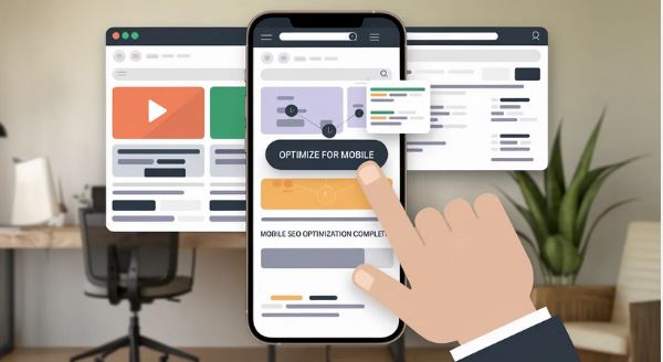
What is Mobile SEO and Why Does it Matter?
Mobile SEO is about optimizing your website to work well on mobile devices. This is key to a successful mobile marketing strategy, as it ensures that your website loads quickly, is easy to navigate, and offers users a seamless experience.
Mobile SEO is critical, as Google now uses mobile-first indexing. This means Google considers your mobile website's performance when ranking it. When you consider that a lot of web traffic comes from mobile devices, you can see why ignoring mobile SEO can result in some missed opportunities. Some of the key benefits of mobile SEO are:
- Improve your visibility in mobile searches.
- Improve engagement and reduce bounce rate.
- Faster load speed for your mobile pages.
- Supports critical standards such as AMP (Accelerated Mobile Pages).
- Improved user experience.
Remember that a good configuration will not only impact your ranking but also your site's visibility for local SEO, voice search, and web traffic.
How to Determine if Your Site is Optimized for Mobile
There are several ways to determine whether your page speed is optimized for mobile devices.
Check Google PageSpeed Insights
Google has PageSpeed Insights, which provides website owners with essential details about their page's speed. The tool can provide you with your website's performance score and track its performance on mobile devices. Here are the steps to follow when using it:
- Enter your site URL on Google PageSpeed Insights.
- You will receive detailed insights into your site's mobile performance, including visual stability, loading speed, and other factors that can affect it.
- The tool will also provide essential insights into how you can improve your score by optimizing images, reducing JavaScript load time, and enabling browser caching. You can improve your SEO ranking by improving these.
Use Google Search to Check Site Performance on Mobile
Google Search Console is also an excellent resource for identifying whether your site has any mobile usability issues. It can help you uncover common SEO challenges, such as elements that are too close together, poorly fitting content, and issues with font size. Here are the steps you need to follow when using it:
- Visit Google Search Console and go to the Mobile Usability section.
- Check for any errors or warnings regarding the site's mobile usability, such as clickable elements that are too small or content that is cut off.
- Resolve these problems to enhance the user experience and ensure your site is perceived as mobile-friendly by Google.
Test Your Site Manually on Various Screen Sizes and Devices
While the above tools can be helpful, they cannot match the level of effectiveness of manually testing your site on multiple devices. Remember that your mobile traffic will come from various devices, so ensure your site works well across platforms. Here are the steps to follow when testing:
- Visit your site on various devices. These could be tablets, smartphones, etc., running both Android and iOS.
- Consider the user experience by paying attention to different factors such as the ease of clicking buttons, reading content, and navigating different menus. Make sure your site loads fast on various devices.
- Check whether any content is getting cut off. Are the texts too small to be read, or are the images distorted? These are key factors that will affect the user experience and mobile usability.
Use DevTools
If you are a developer, DevTools can be a powerful tool for testing your site's mobile responsiveness. It works by simulating your site's functions and appearance across different screen sizes in the browser. You can follow these steps when using the tool:
- Open your site on Google Chrome. Once you press F12, you will open DevTools. Alternatively, you can right-click on any page and choose Inspect.
- Tap on the toggle device toolbar. This is a small item that looks like a phone or tablet. Clicking it will switch to the mobile view.
- Select from screen sizes to simulate how you want the site to look on a mobile device. This will enable you to test the layout and responsiveness of your site.
- You can also view performance metrics in DevTools to see load time and identify potential areas for improvement.
How to Configure Your Site For Mobile Optimization
Mobile SEO requires more than shrinking your site, as both the desktop and mobile versions need to provide a seamless user experience. When you do that, you can provide both the mobile and desktop users with an unattached experience. There are three ways to configure your site for mobile optimization. These are:
Having a Responsive Design for Different Devices
This method is what Google recommends. With a responsive design, the layout will adapt to screen size. It results in a consistent user experience across different devices such as desktops, tablets, and smartphones. This method also makes it easier to manage structured data, meta descriptions, and your entire mobile data.
For your design to be responsive, it should use CSS media queries that automatically adapt the website's elements and layouts to the user's screen size and orientation. Instead of having separate versions for your site, you use a single URL and a single HTML file for all devices.
You can implement this in various ways, such as:
- Leveraging a flexible grid layout, using a relative unit such as %, rem, or em in place of a fixed unit such as px.
- Use media queries to change your style based on the device's width.
- Use CSS rules such as max-width:100% to make your design scale with the container. This will ensure your designs are more responsive.
- Don't use significant elements or fixed-width containers that can make your layout break on small screens.
- Use Chrome Developer Services or Tools such as Google's mobile-friendly test.
How to Configure Your Website for Mobile SEO
Here are several ways of configuring your site for mobile SEO:
Responsive Design
Responsive design is critical for website configuration, as it is easier to implement and maintain. With a responsive design, the same HTML and URL are used for desktop and mobile users, while CSS adjusts the page's layout for each device.
A responsive design is key in mobile SEO as it:
- Uses a single URL to make it easier to share and link, without a separate mobile URL.
- Reduces some common mistakes with mobile sites.
- Lowers maintenance than other methods.
- No need for redirection, resulting in a faster load time.
- Minimizes resource usage during bot crawling of your site.
A responsive design also prevents the serving of duplicate content and some slow redirects. This improves the user experience on different devices.
Dynamic Serving
This involves providing users with the same link across desktop and mobile devices, but different CSS and HTML for each device. The URL remains the same; what changes is what is delivered behind the scenes. However, this may have one problem: the server may send the wrong page. For instance, a smartphone user may see the desktop version, which can affect their experience. While this is usually tricky to maintain, it can offer better results for mobile visitors, particularly when paired with Google Analytics tracking and the right SEO tools.

You can follow these steps in dynamic servings:
- Detect the user agent on the server side to determine if they are using a desktop, mobile, or tablet.
- Configure the CMS or server to serve the HTML or CSS for each device while maintaining a constant URL.
- Maintain detailed detection of the user agent and ensure it stays up to date to avoid misidentification.
- Add a variation. The user agent's HTTP header determines the content served.
Use of Separate URLs
A separate URL means you can have one URL for the desktop version and another one for the mobile URL; in most cases, "m" for mobile is used in the mobile URL. When visiting the site on desktop or mobile, the server detects the user's device and directs them to the appropriate site.
However, using separate URLs can be time-consuming, and many slow down your site. Additionally, this requires the use of the rel= "canonical" and rel=" alternate" tags in the HTML code to indicate that these are two different versions of the same page.
Having the rel= "canonical" tag on the desktop page and the rel=" alternate" tag on the mobile page will help Google determine the version for each device. Without these tags, Google may interpret your pages as duplicate content, which might confuse it on which page to rank, resulting in a lower ranking.
You can follow these steps in implementing this strategy:
- Create two versions of your site. One for mobile devices and the other for desktop.
- Enable user-agent detection and redirect to ensure that mobile users are automatically directed to the mobile version.
- Add some canonical tags to the mobile pages pointing to the desktop page, plus rel=" alternate" tags for the desktop version that link to the mobile version.
- Ensure consistency between metadata and content across different versions to avoid SEO issues or content mismatches.
- Leverage Google Search Console to specify your mobile site and monitor its performance separately.
Best Practices for Mobile SEO in 2026
With the rapid growth of mobile device usage, mobile optimization has become a critical part of any digital marketing strategy. To improve the level of interaction, have consistency on mobile and desktop, and enhance your visibility in the mobile search results< use the following best practices:
Have a Responsive Design
This is an excellent choice for providing a seamless experience on mobile devices, smartphones, and tablets without the need for different URLs/codebases. It can also help with website management and SEO by using the duplicate content and links. Rather than maintaining separate desktop and mobile versions, you can leverage responsive design to reduce development costs and streamline updates.
Therefore, it is recommended that you test your site on various devices, such as desktops, tablets, and smartphones, to ensure your content is visible and the layout is optimized. You can leverage tools such as BrowserStack to run simulations across different screen sizes and devices.
Enhance Your Space Speed
A recent Google study found that 53% of mobile visitors leave if a site takes more than three seconds to load. That means even a one-second delay on your site will impact your website traffic, conversions, and engagement. Speed is essential for mobile device users who may be on 3G or 4G networks or switching between networks while on the go.
When your site loads quickly, you can improve the overall user experience, as users won't have to wait long. This can increase engagement and encourage users to explore even further. We recommend using Google PageSpeed to check for any speed issues. You can then optimize your images, reduce JavaScript, and use browser caching to minimize the load time.
Optimize for Core Web Vitals
Core web vitals are key performance metrics that Google uses to measure your website's user experience. This consists of three major areas:
- Largest Content Paint. An indicator of your site's loading speed. A good metric for optimal performance is under 2.5 seconds.
- Cumulative layout shift. Consider the stability of visuals during loading. Aim for a score of 0.1 seconds for an unmatched user experience.
- First input delay. A measure of your site's response to the action of the user. A good idea would be to keep the speed below 100 milliseconds.
When you focus on the Core Web Vitals, you can be assured of a site that offers a smooth and responsive experience. This is also likely to be rewarded with a higher SERP ranking. You can regularly measure these metrics using tools such as Google Lighthouse.
Avoid Banners and Pop-Ups
When your site contains banner ads and pop-ups, these can impact your ranking on mobile devices. Therefore, you should avoid, or at least minimize, them on mobile devices, as they can frustrate users of smaller screens by taking up most of the available space. This is especially true, as mobile device users need easy access to information.
If your site contains overlays that are hard to close or pop-ups that take over the whole screen, this can increase the bounce rate, reduce engagement, and result in lower rankings. At times, you may even have some well-meaning promotional messages and email sign-up forms that may backfire if usability isn't considered.
If you need to use pop-ups, ensure they don't block the user's content and are easy for users to close. If you are using banners, make them non-intrusive or include slide-ons that do not take up the whole screen.
Add a Mobile-First Navigation Menu
Your menu layout should be optimized for small screens to support less intuitive navigation and drive engagement. Users of mobile devices interact differently from desktop users. They leverage touch gestures, with limited screen space and fast access to critical pages. If your navigation is cluttered or confusing, it can frustrate users and make them go away.
A good navigation menu on mobile devices should make it easy for users to find whatever they need. It includes the essential links to your contact pages, blog section, and product pages in an easy-to-find area. Ensure that your menu improves usability rather than acting as a hurdle.
When you make navigation menus effective, they can increase engagement and reduce bounce rates because it's easier for users to find what they are looking for. A good idea would be to use a sticky navigation or hamburger menu to save space. Use large enough buttons that you can tap without zooming, and organize your menu logically.
Optimize Your Images
Compress and resize your images to minimize load time and deliver high-quality visuals for maximum SEO impact. If you add large, unoptimized images, your website will slow down. Since users of mobile devices may be using a limited data plan, the speed can matter more than on other devices.
Make sure the images are of the right size for the display container. If you are using a 3000 px image in a 300 px mobile view, it can reduce bandwidth and degrade performance. Additionally, excessive image resolution can affect the scroll performance, reduce other assets, and minimize the overall user experience.
Remember that the load speed is an important consideration, particularly on mobile devices. By reducing heavy assets, such as oversized images, you can significantly lower your bounce rate. A good idea would be to use tools such as ImageOptim and TinyPNG to minimize image sizes without affecting quality. You can also use the WebP format to provide high-quality images at smaller sizes.
Leverage the Above-the-Fold Content
Mobile users should find key content quickly without having to keep scrolling, improving user experience and reducing time spent on the site. On mobile devices, the above-the-fold section is what the user sees immediately upon arriving on the landing page, without scrolling. Having such a limited space is key to capturing the user's attention and immediately providing the correct value.
If it's your product offer, headline, or Call to Action, the above-the-fold area will make the first impression. Unless you provide users with valuable information in this space, they are likely to leave. Prioritizing this space can improve user engagement, as visitors can quickly interact with the site without scrolling away.
Therefore, ensure that important details, such as the headline, call to action, and main products or services, are placed in this area. Keep the content short for mobile users so they can immediately see the key elements.
Leverage Schema Markup
Structured schema markup is crucial for helping search engines understand your website's content. Schema markup is microdata that provides context for pages, allowing search engines to determine whether a page is an article, event, recipe, business location, or review.
Adding a schema ensures that your content is legible for the rich results such as FAQs, review stats, product prices, event times, and even business hours. Having these kinds of improved listings will enable your site to stand out in the mobile search, increasing your CTR and improving visibility without the need for a higher ranking. It can especially help when optimizing for AI search results.
A schema markup will enable your site to appear in the rich snippets, increasing visibility and CTR on mobile devices. You can implement them using JSON-LD to focus on what is most relevant to mobile users, such as Local Business Schemas and Product Events.
Maintain Consistency Between Desktop and Mobile Content
You need to ensure that the texts, links, and images displayed on mobile devices match those on desktop for a unified user experience. This is particularly important for mobile-first indexing, which means Google uses the mobile version of your site to index and rank it.
When you have consistency across mobile devices and desktops, users get the same value regardless of the device they use. If there are any discrepancies, such as missing internal links, hidden content, or stripped-down versions, these may confuse your users and bots, resulting in lower engagement and lower rankings.
Consistency across devices will be favored by Google, as it reduces duplicate content and boosts your ranking on mobile devices. Make sure you have similar content, whether images, links, or text, across different versions. What should change is the layout design to accommodate various screen sizes, not the structure or messaging.
In Conclusion
With most users now accessing their favorite websites on mobile devices, it's more important than ever to focus on mobile SEO. This can improve engagement and performance in the search results. Additionally, Google's mobile-first indexing means the algorithm prioritizes mobile content when crawling and ranking your site. That means you will miss a lot of valuable traffic if your website isn't optimized for mobile devices.
Mobile SEO is also critical for local SEO, as it can help customers find your business more easily. If you are wondering how to do mobile SEO, our detailed guide will help you get started.
