#1 Social Media Marketplace
Accelerate Your Social Media Growth with SocialWick. Quickly gain real followers, viewers, likes & more with our blend of marketing tactics. SocialWick is known for its fast delivery, premium quality, and low prices. With over a million satisfied customers since 2017, trust SocialWick to take your social media game to the next level.
1.4 M
Customers
13 M
Orders
362 M
Followers sold
1.8 B
Likes sold
Call to Action Strategies That Convert
Published on 12.09.2026 by Tracey Chizoba Fletcher
Perhaps you have ever scrolled through a site online and didn't know what to do next. That is how visitors to your site feel when there is no call-to-action. It is worthy of note that a CTA helps users to easily navigate through your site and gently nudges them to act on the required action. This is why you should understand how to add a call-to-action button that converts, as part of your website or social media funnel sales strategy.
However, many creators and marketers think that a CTA is only about adding a Buy Now button. A good one should guide your audience to a valuable resource in a manner that feels natural. Here, we guide you on creating one.
What a Call-to-Action Button Means
CTAs are regarded as a brief and clear prompt encouraging social media audiences to carry out an action, such as purchasing a product, subscribing to an email newsletter, or downloading an ebook. It is an important part of ensuring that your customers are not only engaging with your social media content, but they are moving on to the next action.
CTAs are usually present on a wide range of channels such as websites, emails, blogs, and white papers. They can use different words, such as:
- Click this button to start a free trial. A button that prompts users to try out a new product without any commitment.
- Download our detailed guide. A CTA that encourages email sign-up by providing a valuable resource.
- Buy now to get a 20% discount. A great CTA for creating urgency.
- Book your personalized demo. Helps invite your customers so they can see the products in action.
Why CTAs are Important in Social Media Marketing
Here are some benefits of having a CTA:
Turn Interests Into Actions
It is hard work to drive traffic to your site, especially in an era when people are just scrolling through posts. However, without directing people to the next action, this traffic will go to waste. When you have a strong CTA, you can ensure that your efforts are paying off, as it turns people’s interest into action.
By adding words such as “Get your free offer” or “Start today”, you will be providing them with a little nudge. Your customer doesn't have to keep guessing what you want them to do. Instead, it should be easy to do so.
Enable Customers to Find Their Direction
Whether it's in social media posts, ads, websites, or emails, a CTA can help customers find their way around. When you use a CTA in the right place with a button that says Learn More or Try for Free, you will be guiding them on the right action to take. By making their paths clear, you will make them confident to move forward in their businesses.
Enable People to Engage
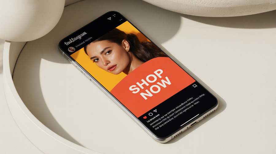
When you have a CTA that is well positioned, in an area on top of the fold or near the main key decision points, this will feel inviting and natural, encouraging people to click. When you add the Shop Now and Book for a Call buttons, you can remove the hesitation, so it is easier for customers to make decisions. Since your customers are searching for a decision, it should be easier for them to do so.
Understand What Works and What Doesn’t
A CTA should provide important insights into what is attention-catching and what isn't. If you are getting more clicks using the Download Now button or the Get Your Guide, you can easily understand the best-working message. By testing the different CTAs, you can find the words that will enable you to connect with the audience,
How to Create Converting CTAs
There are certain elements you need to add to your CTAs to increase the conversion rate.
Place it Optimally
One of the factors that will impact the performance is the location where it is placed. This is important, as it affects the ability of the user to find the CTA and act on it.
Some of the areas with a high conversion include:
- On top of the fold. Also known as the hero section, this refers to the first noticeable screen location. Studies suggest that a CTA in this location can be easily noticed, leading to instant action.
- Bottom of the content. Before clicking on a CTA, many social media users prefer to start by reading the details. Therefore, the best place to add the CTA is at the bottom of a product description, case study, or blog post. This ensures that your audience doesn't have to scroll backward before making a decision.
- Sidebars and in-text. You can add the CTA in the middle of long-form content for people who like to skim or use sticky notes.
Use Concise and Clear Messaging
A great CTA shouldn't leave your audience confused. Instead, it should use simple, to-the-point text that is comprehensible at a glance. You need to ensure that your visitors clearly understand the next step they should take. That's why words such as Download Now or Get Started are effective, as they are more direct and not ambiguous.
Some important tips for doing that include:
- Using action-oriented words. Rather than saying, “Tap here to download,” say, “Download now.”
- Cut out fillers. Instead of saying, “Sign up now before you miss our upcoming webinar,” you can say, “Join our webinar now.”
- Use a time-sensitive word. Such as Claim now, Offer ends today, or Offer while stock lasts. This creates urgency.
Use Bold Colors for Best Effects
One of the factors that impacts a CTA design is color psychology. When you add some bold and highly contrasting colors such as green, orange, or red, you can make your CTA outstanding. However, you need to ensure that your choice of color matches your product and retains accessibility standards.
Add a Persuasive and Creative Copy
Even though the standard CTAs are quite effective, you can improve their impact by being more creative. You can use engaging and relatable content to increase the click-through rate, especially when you combine it with convincing elements that add a sense of urgency or curiosity. This is especially a good strategy for interactive posts like surveys and quizzes, where an outstanding CTA can increase participation level.
Use White Space Strategically
One of the factors that will impact the effectiveness of the CTA is the design. When you add enough space to a CTA, you provide it with some breathing space while making it outstanding. On the other hand, adding many elements can leave your page feeling overwhelming, minimizing the chances of conversion.
Match CTA to Content
The choice of a CTA depends on the location where your audience is interacting with it. You can end your blog post with Learn more. On the other hand, “Claim this offer” may work for your email campaign. The CTA placement also matters.
- Blog post. You can place it at the bottom with words such as “Read our full guide” or “Explore more tips.”
- Emails. You can add a clear CTA like “Get your 10% off instead of using plain text.”
- Paid ads. You can use some dynamic CTAs, such as Shop Now, or keep adjusting depending on the user data.
Be Outstanding
You need to ensure that your CTA stands out from the content in the other part of the page. You can do that by using bold fonts, contrasting colors, and placing them strategically, so that users can quickly find and click on the CTA. Otherwise, if you are using a CTA that easily blends with the background, this may be easily overlooked.
Leverage A/B Testing
No matter how much time and effort you put into creating the perfect CTA, you cannot tell if it will work until you have tested it. A/B testing involves testing different elements of a CTA to determine the one that brings the best result.
A good idea would be to test different elements such as the color, size, text, and placement. For instance, you can test:
- Text variations such as Get Started Now vs. Sign up for Free.
- Button color: Orange vs. Yellow to decipher which color is getting more clicks.
- Placement. Bottom vs. top of page.
- Size: Small vs. large buttons.
By continuously testing, you can easily determine the best-converting CTAs.
Add Power Words
Using action-oriented words can help increase engagement, as it prompts your audience to take instant action. Therefore, try using different words such as Explore, Discover, or Shop to have a compelling CTA. These words can help you increase excitement and enable followers to take action fast. For instance, instead of using generic words such as “Learn More” or Explore Latest Trends," use words that add intrigue and urgency.
Use FOMO
In addition to using power words, adding urgency can help increase your conversion. Use words that stir people to act or risk missing out, such as “Only 5 spots left. This discount is valid for today, or the offer ends in one day.” All these phrases leverage FOMO and stir users to take instant action. This is an effective strategy for reducing hesitation and driving engagement.
In Conclusion
The CTA is one of the most important elements that will determine the conversion rate of your copy. By implementing the above CTA guidelines, you can increase your conversion rate and enhance the overall performance of your copy. However, remember to always keep testing and refining to determine the most effective option for your target audience. You can read our guide on the rise of virtual Try-ons to increase conversion.

Sign up for SocialWick
Login
InstagramYouTubeTikTokFacebookTwitchSpotifyTwitter (X)SoundCloudIGTVLinkedInThreadsWebsitePinterestVKApple MusicSEO
Checkout
OK

Information
Order processing usually starts within a few minutes, but some services may take a few hours or even a few days. We offer free refills for up to 90 days if needed. Our services are 100% secure and discreet, with a focus on gradual and safe delivery for your peace of mind.
Order processing usually starts within a few minutes, but some services may take a few hours or even a few days. We offer free refills for up to 90 days if needed. Our services are 100% secure and discreet, with a focus on gradual and safe delivery for your peace of mind.
Where should we send your order confirmation?
No account needed! We send your confirmation and tracking link here.
Secure checkout. We never share your email.
Have an account?•
Log in
Use your account to pay faster with your saved details.
Create account
Create an account to track all your orders in one place.
Service
+0,00
Voucher
-0.00
Total
+0.00
OK
Affiliate & Reseller Program
Customer Support
How may we help you?
General Support
Order Support
Frequently Asked Questions
1) What services do you offer?
We are a social media marketing company, and we offer a wide variety of services across several platforms that our clients can choose from. Once selected, we create a plan that fits your needs. We offer several types of services, such as followers, subscribers, likes, views, song plays, etc.
2) Is your service safe?
Yes, as we only sell real followers, likes, views, etc., and we hold every service to strict authenticity and quality standards. In order to protect your account, we deliver every order carefully and gradually. We closely monitor all our services. For more information, we strongly recommend reading our Terms of Service before you order.
3) Will I need to give you the passwords for my accounts?
No, you can keep your passwords to yourself because our services don’t need a password to influence your accounts. And if an email ever shows up claiming to be from us and asking for a password, it’s definitely not us, so please let us know right away.
4) Are the likes, followers, and subscribers real, or are they bots?
Unlike many other services, all our likes, followers, and views come from real accounts operated by real people. You won’t find bots, fake profiles, or hijacked accounts anywhere in what we deliver. Every order has to pass our strict authenticity standards, and we keep checking our quality to make sure it stays that way.
5) How fast can you deliver my order?
We will show you the estimated delivery time when choosing the service. However, this is only a rough estimate. In most cases, the services are delivered much faster. In some cases, it may take longer. We always aim for a natural and safe delivery!
6) What are your best-selling social media marketing services?
Although we have many services across most social media companies, our services for Instagram, TikTok, and YouTube are our best-selling options.
7) How do I know my account will not be flagged or banned?
We take safety very seriously. We never ask for your password, all followers, likes, and views come from real accounts, and orders are usually delivered gradually and naturally. What we can promise is careful delivery and strict quality standards. Plus a support team that’s there whenever you need us. We are not aware of a single case since 2017 where a customer got his profile banned.
8) What is the best method to communicate with you?
Do you have a question or run into a problem? Our customer support is available 24/7 for you. Just click Contact and you’ll land right on the support form. When you buy one of our services, we will email you to see if there were any problems. Your satisfaction is our main priority.
9) Are there discounts for large orders?
Yes! If you would like to request a large order that isn’t on our ordering layout, we will have no problems accommodating you. Just reach out through the support form and we’ll put together a buying plan that fits what you need.
10) What methods of payment do you accept?
We accept all forms of credit and debit cards, as well as Klarna, eps, PayPal, and Crypto.
11) If I am unsatisfied with your services, am I able to receive a refund?
Yes! Every purchase comes with a 30 day money-back guarantee. Not satisfied? Just contact our support within 30 days of your purchase and send us your order details and a short note on what went wrong, and we’ll take a look at your case. The full conditions are in our Refund Policy.
12) I haven’t received my order
Please make sure the following criteria are met before placing an order to make sure we can deliver it successfully.
- Your account is set to public
- You have typed in the correct username or link
- You have not changed your username before the order’s completion
- The post or account still exists and has not been deleted
- The post or account has not been restricted or removed in some countries
- Allow the estimated delivery time for completion of your order
For further assistance, please message our support team through the contact form.
13) How can I request a refill?
Just send us a refill request through the contact form. Please note that we can only provide you with a free refill within the first 90 days of your purchase.
Learn More
What is SocialWick?
We are the leading marketplace for social media promotion. You can buy followers, likes, views, subscribers, and a lot more for almost all social media networks. We offer affordable prices without making any compromises in terms of the service quality. We have a strict policy to only sell social media signals from real people. Part of our engagement, for example, comes from ad-based promotion where real users discover the content through ads. Bots, fake profiles, and hijacked accounts have no place in our services. Every delivery has to meet our authenticity standards, and we run regular quality checks, and anything that does not meet them is removed from our catalog. Our services are available for personal use, whether you want more Instagram likes, TikTok followers, YouTube views, or something else for your own profile.
With over a million satisfied customers, SocialWick is the go-to platform for all your social media needs. Our services are discreet and secure, with gradual and careful delivery to keep your social media accounts safe.
About SocialWick — The Market Leader since 2017
With more than 10 million orders, SocialWick is one of the world’s biggest social media stores. You can find everything on our website to improve your presence on major social media platforms like Instagram, TikTok, YouTube, Twitter (X), Facebook, etc. We offer different types of services for several social media platforms. Your wish is our command, and whatever your goal might be, SocialWick will help you achieve it. Whether you need more likes on your Instagram photos or want to make your LinkedIn profile more popular by getting additional followers, SocialWick is there to turn your goal into reality.
Thanks to our effective services and our customer-oriented work, SocialWick has become a top player. You will not find a better service anywhere else, especially not at such affordable prices. SocialWick is operating since 2017.
365 Days Per Year Customer Service
Your satisfaction is our motivation! We’re not here just for the money; we do our work to help people find their road to social media success. And that’s why our team will do all to make sure everything goes according to plan. If there’s something wrong with your social media campaign, or worry that there might be some problems with your account, or want to learn more about how our services work, feel free to reach out. Our service staff is there for you seven days a week, ready to answer any of your questions. You can get in touch with us using the contact form on our website.
Buying Followers and Likes is Essential
Unless you’re Kylie Jenner, you definitely need some help with social media. The more followers you have on Instagram, TikTok, Twitter (X), or YouTube, the more people will automatically notice you. Having all those eyes on your content isn’t just impressive, it’s genuinely fun. The bad news is that everyone wants to be famous these days, but only a few can succeed. The good news is that you can be the chosen one who will get social media fame and everything that comes with it. But, for that, you need a little help from your friends at SocialWick.
With our help, you will increase the number of followers on social media, which can have a domino effect and bring you even more new followers. Once people see that you got a big followership, they will decide to give you a follow. "If a profile has so many followers, it means that it’s interesting" – you can be sure this is going to be their reasoning. Furthermore, more followers mean more visibility for everything you post. Finally, a large number of followers also do great for your credibility. Our social media services will help you to create a better overall picture of your profile.
Let’s be honest; a profile with 30,000 followers looks much better than one with 74 followers. And that’s exactly what new visitors will pay attention to. A weak social media profile can be a real deal-breaker. At the same time, a fantastic social media profile can do wonders for you. And SocialWick can make your social media profile amazing!